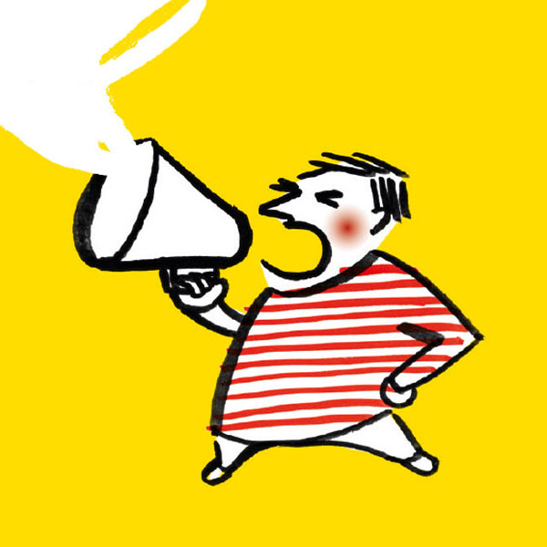
Posted at 16:29h
in
Contribution to the initiative "Mit mir 90 Prozent"
This is a project that’s important to me and that I provided an illustration for. It’s about encouraging people to get out and vote in the national elections in September 2017 in Germany.
Several cards were designed to promote...
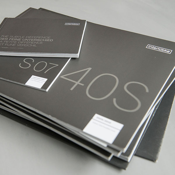
Posted at 20:04h
in
interlübke
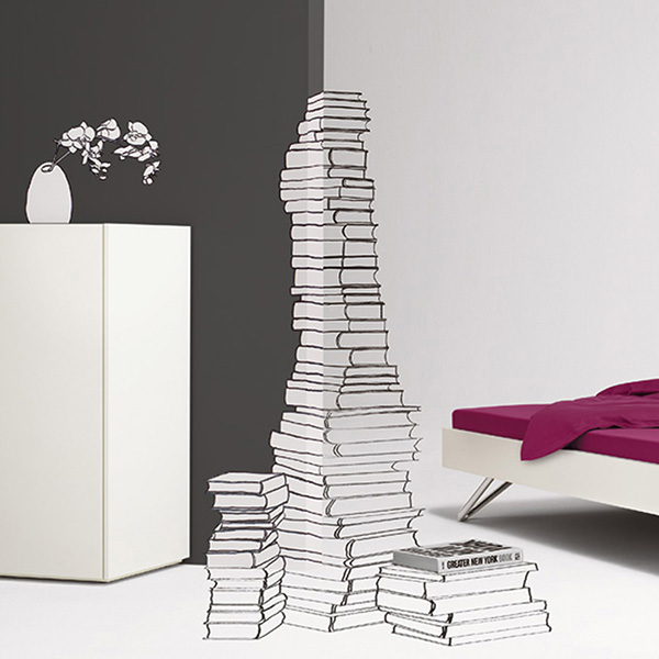
Over the course of two years I nurtured the interlübke brand, a leading manufacturer of premium furniture. I adapted numerous catalogues, developed newspapers and other catalogue formats, visualized furniture specifications, illustrated, worked on the relaunch of the stationary and created print products for fairs and...
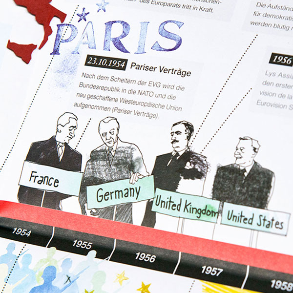
Posted at 21:25h
in
Timeline poster – the history of the European Union
The Federal Agency for Civic Education (BPB) has a mandate from the German Federal Ministry of the Interior to realize a spectrum of publications aiming to explain political concepts and interdependencies.
We developed a successful series of timeline...
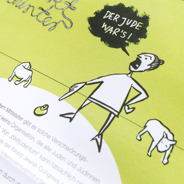
Posted at 20:22h
in
Against discrimination
In 2015, the BPB launched a poster series against discrimination, providing useful strategies for dealing with it in daily life.
My colleages and I developed the first ones, on the topics of racism, homophobia and antisemitism. The target group is diverse: from a soccer club to...
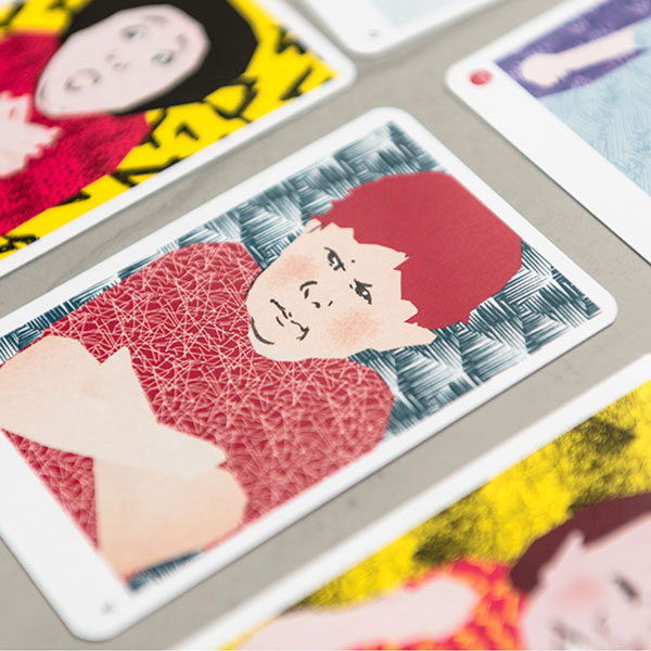
Posted at 19:24h
in
Wie geht's?
This game is aimed at beginners of the German language, including both children and refugees. The game contains 24 illustrations and 94 words, each of which expresses a certain emotion.
The idea and the main focus of the illustrations were to distinguish and emphasize the different...
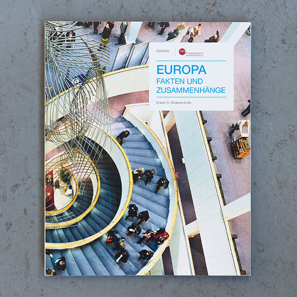
Posted at 19:06h
in
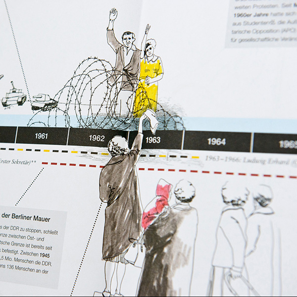
Zeitbild Europa
The series Zeitbilder of the Federal Agency for Civic Education (BPB) provides vivid publications about history, culture and society.
We redesigned the series to a more editorial look to provide different levels for the reader to dive into the topic, through typography and imagery.
Zeitbild Europa was the first one...
Posted at 17:35h
in
Bergisches Wanderland
The Bergische Wanderland is an EU-funded project that supports the expansion of a number of short and long distance hiking trails.
An original design was developed for this tourism project, which incorporated a logo,
illustration style with typography, visual style, corporate stationery, brochures, verbal style, advertisements...
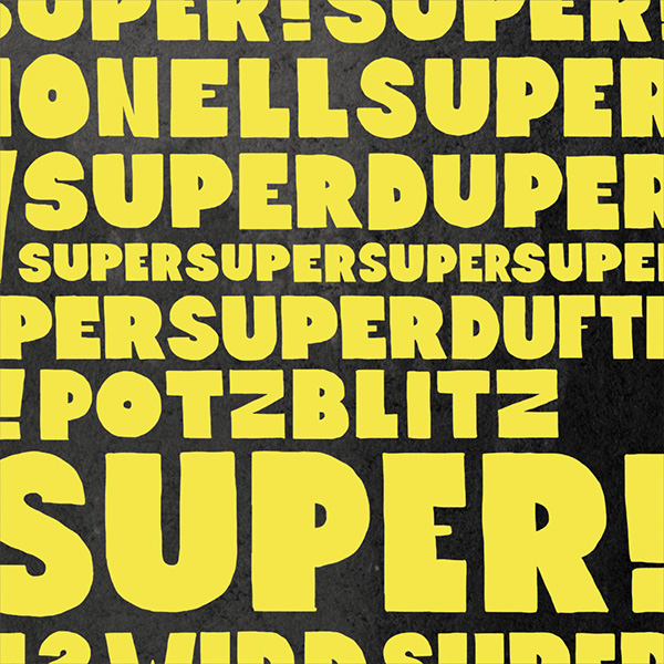
Posted at 02:38h
in
Superheroes
What started as the search for a fresh idea for a Christmas card, developed into a calendar of super heroes to protect against everyday evil.
Customers and friends of the Leitwerk agency received a new super hero in the mail every month – illustrated by Leitwerk’s...
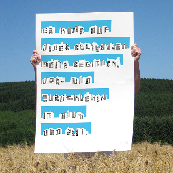
Posted at 23:55h
in
Poster Series
“Reading the City” is a typographic experiment inspired by Cees Nooteboom aiming to capture the essence of the city as a concept....
Posted at 14:45h
in
Lorem ipsum dolor sit amet, consectetuer adipiscing elit. Nam cursus. Morbi ut mi. Nullam enim leo, egestas id, condimentum at, laoreet mattis, massa....
Posted at 14:39h
in
Lorem ipsum dolor sit amet, consectetuer adipiscing elit. Nam cursus. Morbi ut mi. Nullam enim leo, egestas id, condimentum at, laoreet mattis, massa....
Posted at 14:21h
in
Lorem ipsum dolor sit amet, consectetuer adipiscing elit. Nam cursus. Morbi ut mi. Nullam enim leo, egestas id, condimentum at, laoreet mattis, massa....